
Grid and header configuration
The grids are easily configurable in the K2 or Joomla com_content settings regarding your subpage choice.
Grid can be used only on the listings pages. Amount of columns for the grid is specified in the category settings by number of columns for a leading items:
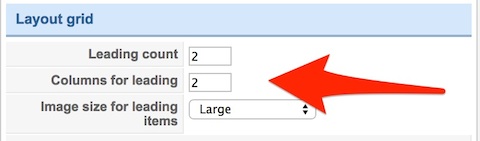
If you are using a menu item for few K2 categories you can specify the number of columns in the menu item settings. In other cases (one category), you have to specify number of columns in the category settings.
The grid and featured images are covered on a specific area. Height of this area can be changed under the “Images” tab in the template settings:
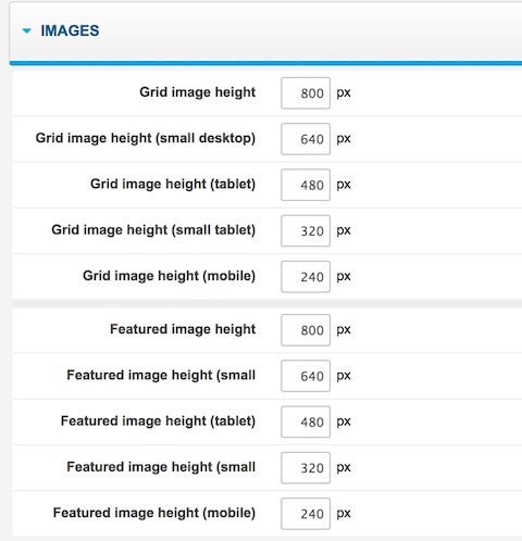
You can specify different heights for different screen sizes.
The portfolio items filtering is possible in K2 category pages, where the tags for items are available - the items can be then filtered by tags.
For K2 categories there are two special layouts available: portfolio and portfolio-grid. Portfolio is a normal view with spaces between photos. Portfolio Grid uses the grid layout and the tag-based filter.
Page suffixes
- no-full-width - disables the full width mode for a specific page (useful in example for a standard portfolio view for a category).
- full-width - enables the full width mode for a specific page (if the specific page doesn’t support the full-width layout by default).
- narrow-width - creates a more narrow version of the page
Some pages like com_content, com_k2 subpages are full width by default. Additionally on the some subpages like single item pages the breadcrumb and sidebar module positions are not available
Animated images
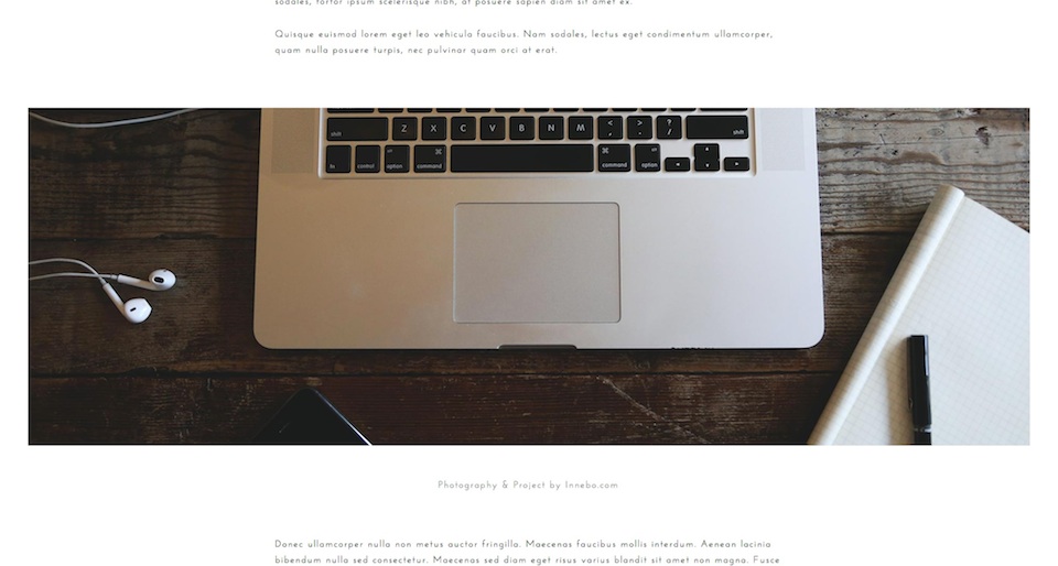
Animations for the article images can be created with the scrollreveal.js script and with usage of a specific HTML structure:
<p class="gk-wide-image" data-sr="enter bottom and move 200px and scale up 20% over 1s">
<img src="/images/demo/wide-blog-image.jpg" alt="Photography & Project by Innebo.com" />
<small>Photography & Project by Innebo.com</small>
</p>
Useful options
The top logo can be disabled at the specific subpages using the options from the Features tab.
Special HTML structures
Social icons

Social icons are created by a special structure of HTML visible below:
<a href="#" class="gk-icon-fb">Facebook</a>
<a href="#" class="gk-icon-twitter">Twitter</a>
<a href="#" class="gk-icon-gplus">G+</a>
<a href="#" class="gk-icon-pinterest">Pinterest</a>
<a href="#" class="gk-icon-dribbble">dribbble</a>
<a href="#" class="gk-icon-behance">Behance</a>
Project info block
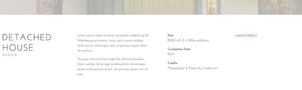
The project info block should be placed as an introtext of the item using the following structure:
<div class="project-info">

     <div class="project-description">

          <p>Lorem ipsum dolor sit amet, consectetur adipiscing elit. Pellentesque accumsan, turpis quis viverra sodales, tortor ipsum scelerisque nibh, at posuere sapien diam sit amet ex.</p>
          <p>Quisque euismod lorem eget leo vehicula faucibus. Nam sodales, lectus eget condimentum ullamcorper, quam nulla posuere turpis, nec pulvinar quam orci at erat.</p>

     </div>

     <dl class="project-details">
          <dt>Size:</dt>
          <dd>8000 m2, 2 × 240m platforms</dd>
          <dt>Completion Date:</dt>
          <dd>2014</dd>
          <dt>Credits:</dt>
          <dd>Photography & Project by Innebo.com</dd>
     </dl>

     <div class="project-link"> <a href="#">Launch Project</a> </div>

</div>
It will work properly only if the item category uses portfolio or portfolio-grid layout
Map in the contact form
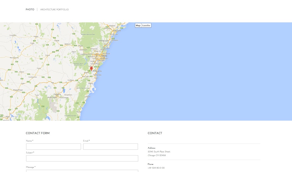
The map for the contact form can be easily created by using in the Other information field for the contact the following code:
<div class="gk-map static" data-latitude="-34.397" data-longitude="150.644" data-ui="yes" data-zoom=“8”></div>
The data-latitude and data-longitude attributes are used to specify the map center and place of the marker. data-ui attribute specifies if the UI elements will be displayed. data-zoom attribute specifies the level of zoom (1–20).
Advices
- The menu supports 3 levels, but we recommend to use at most 2 levels - as the submenu levels will me easier to achieve.
- We recommend to use up to 4 columns in the grid view - more columns can need more CSS adjustments.
- The author avatars in com_content items comes from the Gravatar service and are based on the user e-mail.
- We recommend to use the text logo. If you will want to use the image logo please use the horizontal images - they will best adjust the available space.